JioBook Design System

Reliance Jio

JioBook Design System

The new JioBook design system, to create a seamless experience for all users.

Role

Design System · UX · UI

Deliverables

Design system, user experience, user interface

Discipline

Design system

Surface

Laptop OS

Context

JioBook is an entry-level notebook designed for users in Tier 2 and Tier 3 cities, including first-time laptop buyers and school and college students.

Its digital experience did not align with Jio’s commitment to accessibility, and an inconsistent interface led to a subpar experience. With a vision of launching an affordable, accessible notebook, Jio recognised the need for a robust design system.

Approach

How the work was made.

Phase 1 — Process

Discovery and research

The project started with a detailed phase of discovery and research. We went deep into organisational goals, user needs and existing design challenges. Through interviews with key stakeholders and comprehensive research on competitors’ design systems and industry best practices, we identified pain points, inconsistencies and opportunities in the current design.

We then defined clear goals and objectives for the system, and created user personas to understand the diverse needs of stakeholders. We outlined the scope of components, patterns and guidelines. The design principles emphasised clarity, accessibility, inclusivity, consistency and scalability.
Phase 2 — Design tokens

Encapsulating the decisions

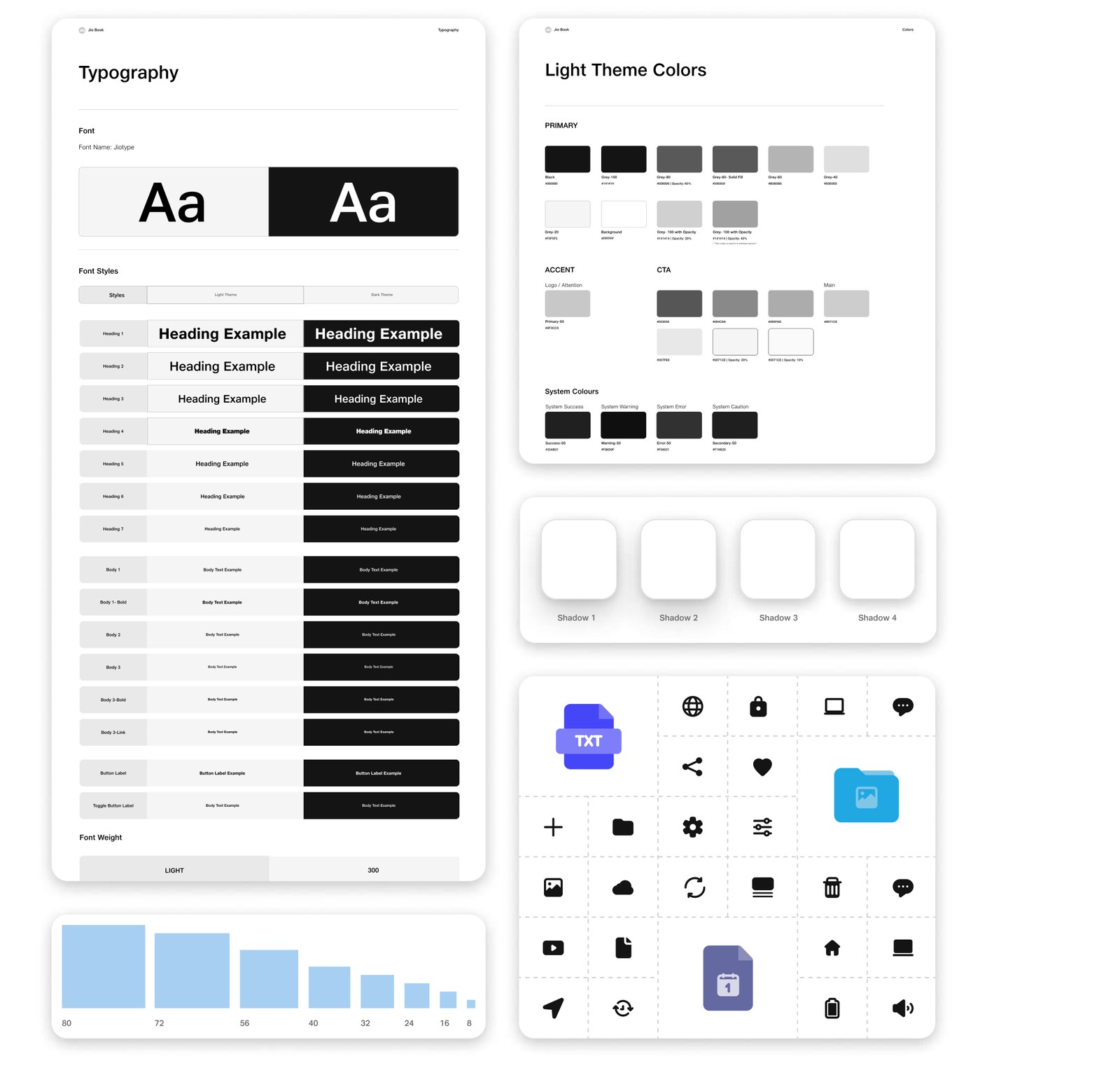
Design tokens were the crucial first step towards visual consistency and accessibility. They encapsulated essential design decisions — colour choices, typography selections, spacing guidelines — in a structured and consistent manner.

The result was a unified visual language, easily adaptable across apps, user flows and use cases, so every element in the JioBook ecosystem adhered to the same set of rules.

Typography, light theme colours, spacing scale and iconography
Phase 2 — Templates

Reusable, scalable patterns

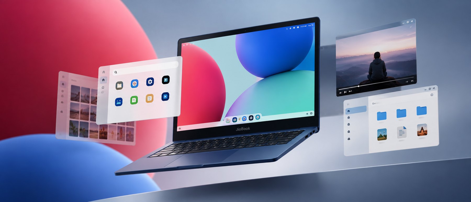
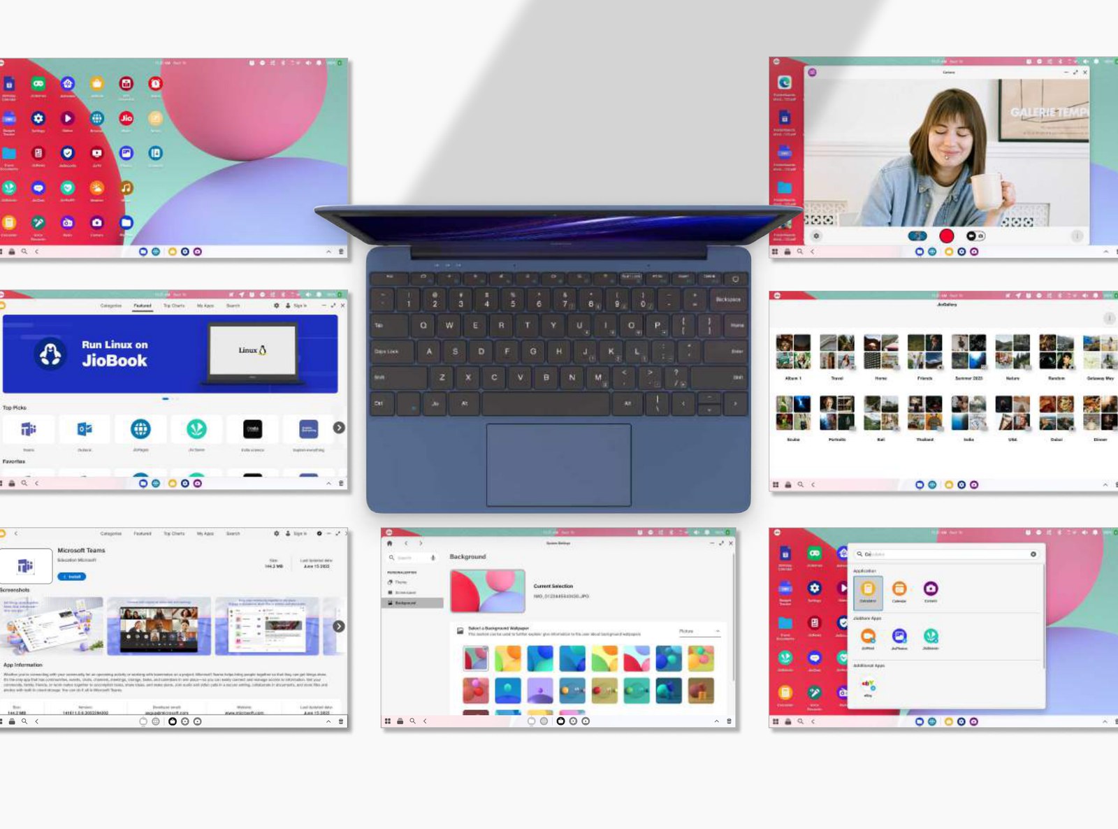
With the visual basics and components defined, we built complex, reusable and scalable patterns: notification messages, modal windows, window definitions, task bars, native application landing pages, right-click windows and the desktop.

Templates — desktop, store, gallery, settings and app detail
Phase 2 — Dark theme

Readability in every condition

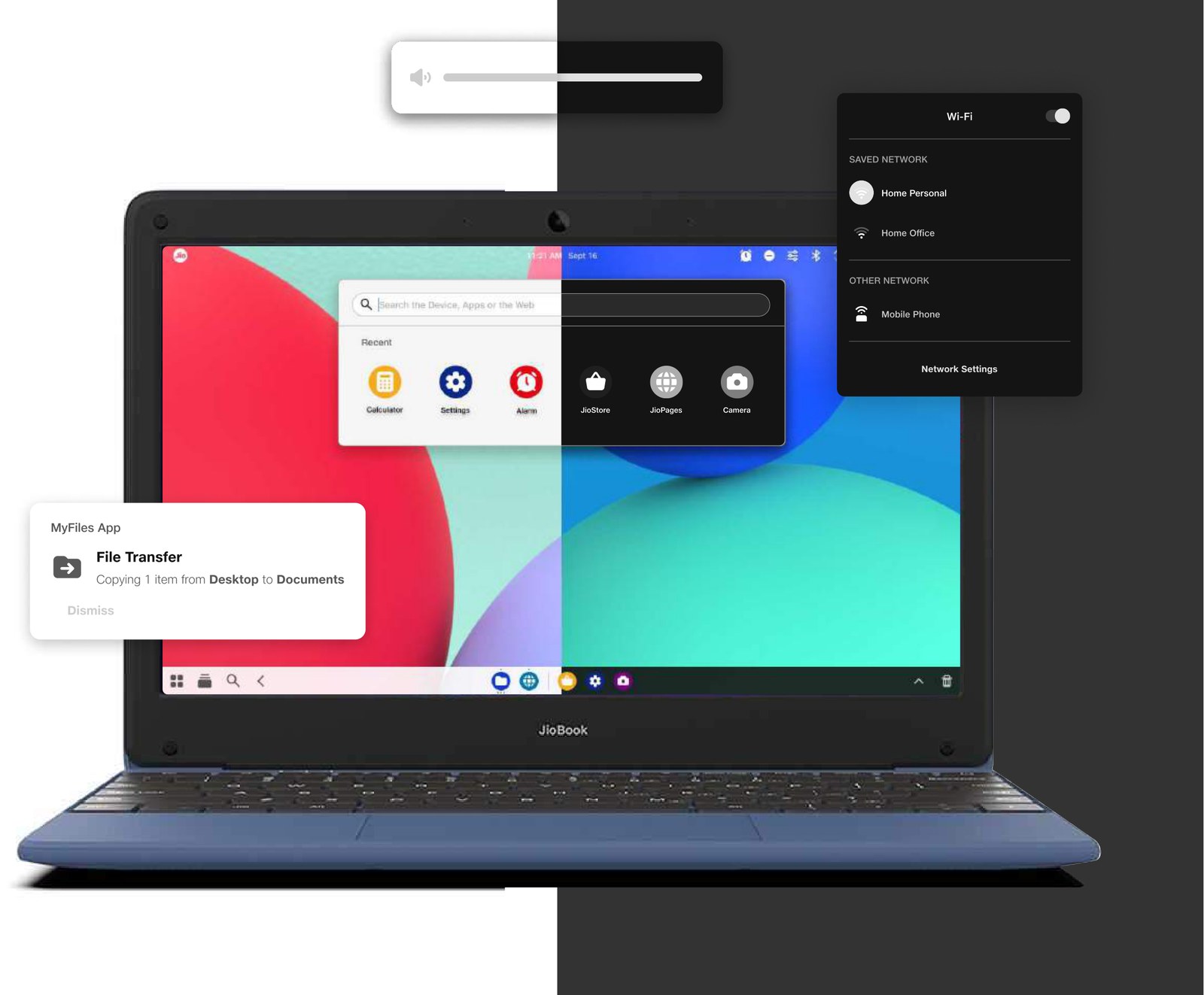
Designing the dark theme was a meticulous process focused on both aesthetics and experience. Contrast ratios were adjusted, the colour palette fine-tuned, and interface elements such as icons and typography optimised. Smooth transitions between light and dark were implemented, and usability testing refined the theme against real preferences.

Dark theme — desktop, notifications and network settings
Phase 3 — Documentation

The blueprint

The last step was the design system document — the cornerstone of a successful system, and a reference for everyone involved, from designers and developers to stakeholders. It outlines the rules, guidelines and components that hold visual and functional consistency across the product.

Impact

Shipped and measured.

60%Decrease in clarity calls

A 60% decrease in stakeholder clarity calls, fostering better cross-functional communication.

ConsistencyIncreased

Faster design iterations and development cycles using pre-defined components.

SpeedTo market

Significant reduction in development time, thanks to existing components and guidelines.

Let’s talk.

Tell us about the product — where it is now, and what needs to get clearer.

hello@lumosdesign.co

Quick response.

If you’re ready to create and collaborate, we’d love to hear from you.

Clear next steps.

After the first conversation we come back with questions, then a scope and a timeline.